I really like doing Flip Cups, they always turn out so differently. In this pour I used Silicone oil to encourage cells to form. Yep, I got some huge cells, not exactly what I was going for. And, they are rather out of shape, I really wanted nice round ones. Oh, well, maybe next time!!
Colors used for this one listed below and in the image above. Except for the black, I forgot to use it.
Mont Marte - Light Blue
Mont Marte - Phthalo Turquoise
Mont Marte - Ultramarine Blue
Mont Marte - Mid Green
Mont Marte - Dark Green
Mont Marte - Shiraz
Mont Marte - Silver
Expression Art - White
Put a few drops of Silicone in each of the colors except the Silver and the White.
8 x 8 inch canvas
Taped two sticks to the back to help with tilting!
Colors ready to go....
After the flip and tilt...
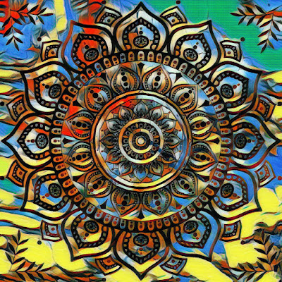
Notice how the cells are not round! I had too much paint on the canvas, and by the time I tilted the excess off, my cells were shaped like this. But, I still like the final product, which I then embellished with a Mandala.
Looks good! Below is the final painting before I added the Mandala. I am so glad I added the Mandala! Really makes it pop!
Below is the YouTube creation video. Start to finish.
The Mandala looks good on a wall!
I have uploaded the images to my Redbubble store and they look good on the products, some of them below -
To see the rest of the products with this design click >here<
Love how the Mandala looks on the products. So much so, that I digitally enhanced the image and created more images to upload to Redbubble. I will share some of those further down....
Check out all of the products with this design >here<
Below are some of the digitally enhanced images of the same Mandala in various colors.
Love how they all look and they look really great on the Redbubble products.
If you want to check out the products using the above Mandalas click on each image above and it will take you directly to the product page on Redbubble.
I am so happy how these turned out. I am surely going to do more Mandalas.
Check out links to my other socials here → Linktr.ee
It is amazing what a digital app can do for your designs. Takes them to the next level. I currently use Canva for all my video creations and embellishing my finished art piece to see how it looks before actually painting embellishments onto them. You can check Canva out <here>
AFFILIATE DISCLOSURE: My blog contains affiliate links, which means that if you click on one of the product links, I may receive a small commission if you decide to purchase from any of the products.
Another Dutch Pour using colorful bright colors. Love how this one turned out. And, I played around with digital enhancements to create some truly pretty designs which will be great for my Print on Demand sites.
Colors used -
Base - Amsterdam Titanium White
Global - Gold
Amsterdam - Turquoise
Amsterdam - Ultramarine Violet
Pebeo - Iridescent Green/Yellow
Pebeo - Iridescent Blue/Green
Paints mixed with Australian Floetrol.
My paint recipe is based on Kanella Ciraco's Aussie paint mix. You can see her video on YouTube on how to mix.
Below is the creation video for this Dutch Pour.
Finished
On a Wall
After Embellishing
On a Wall
Once again the finished design has been uploaded to my Redbubble Store and the design looks great on all of the products. I also turned the image into a pattern for some of the products, looks great too. Below are some of the products with this Dutch Pour....
I purchased this shirt for myself and I absolutely love it. The colors look bright and true to the original painting. I like to purchase some of the items from my stores to make sure that the quality is good.
As you can see by the above examples, the designs look great. Please check out my Redbubble Store for all my other designs.
Check out links to my other socials here → Linktr.ee
Some more images below of the enhancements I did for this Dutch Pour with a Digital App.
It is amazing what a digital app can do for your designs. Takes them to the next level. I currently use Canva for all my video creations and embellishing my finished art piece to see how it looks before actually painting embellishments onto them. You can check Canva out <here>
AFFILIATE DISCLOSURE: My blog contains affiliate links, which means that if you click on one of the product links, I may receive a small commission if you decide to purchase from any of the products.
Back to doing what I love, Dutch Pours. I really love how the colors blend and flow across the canvas.
This one has a lot of really lovely colors. I also did another pour using the same colors but blowing them out all over the canvas. Hopefully, will do a larger canvas with the colors to compliment the main one in the image above.
Colors used -
Base -
Amsterdam Titanium White
Colors -
Atelier - Pthalo Green
Pebeo - Iridescent Blue/Green
Amsterdam - Greenish Blue
Pebeo - Iridescent Green/Yellow
Global - Metallic Blue
Global - Gold
Amsterdam - Ultramarine Violet
Paints mixed with Australian Floetrol.
My paint recipe is based on Kanella Ciraco's Aussie paint mix. You can see her video on YouTube on how to mix.
Link to her video here → Kanella Ciraco Art
Video below showing the pour -
Finished
Looks good on a wall!
Below is the video with my demo pour using the whole canvas. I think it would have looked far better on a larger canvas, so, hopefully it will look better than this one when I get to do it.
Enhanced Image
On a wall
Embellished
Haven't uploaded these images to my Redbubble store as yet. Might do it , or, maybe not. But, will most certainly upload some of them here if I do. Really love how my art looks on Print on Demand products.
AFFILIATE DISCLOSURE: My blog contains affiliate links, which means that if you click on one of the product links, I may receive a small commission if you decide to purchase from any of the products.