
I recently tried this new technique that I found on YouTube. A gradient background using a clear base for a Dutch Pour. Above is my second attempt. Quite like how it turned out.
The first step you need to take is to paint your gradient background on your canvas or whatever you might be using.
In this case I used blues for my background.

Colors used were Amsterdam Titanium White - Amsterdam Phthalo Blue - Mont Marte Sky Blue - Mont Marte Deep Cyan
And, the finished result below-

Next step is to let this dry and then use something round to mark out a circle. Then, paint the outside with a contrasting color.


I used Australian Floetrol for the clear base with a touch of a pouring medium. Aussie Floetrol is really thin. Other Youtubers used the US Floetrol which is far thicker. They had to thin it down by adding some water to it.
Base covered with clear medium.

Next step is to lay down your Dutch Pour colors. For this pour I used -
Amsterdam - Prussian Blue
Amsterdam - Pearl White
Atelier - Silver
Pebeo - Iridescent Blue Green
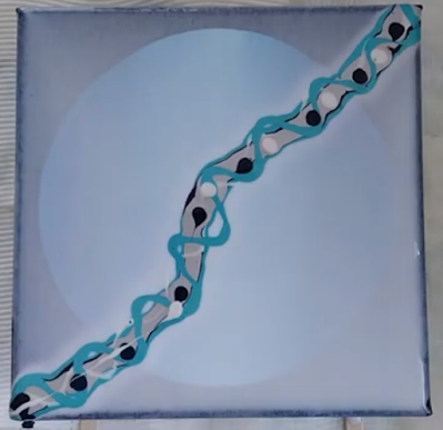
Last step - blow out the colors to make your design. Then, wait for the magic to happen when it is all dried.

Dried Result below


This is my first attempt - just for comparison.

Check out links to my other socials here → Linktr.ee
It is amazing what a digital app can do for your designs. Takes them to the next level. I currently use Canva for all my video creations and embellishing my finished art piece to see how it looks before actually painting embellishments onto them. You can check Canva out <here>

AFFILIATE DISCLOSURE: My blog contains affiliate links, which means that if you click on one of the product links, I may receive a small commission if you decide to purchase from any of the products.
#acrylicpouring #fluidart #acrylicpainting #fineart #pourpainting #artistry #colorpalette #artwork #artlovers #originalpainting #acrylic #craft #tutorial #arttutorial


No comments:
Post a Comment