Sunday, June 26, 2022

Colorful Dutch Pour - #FluidArt #AcrylicPainting


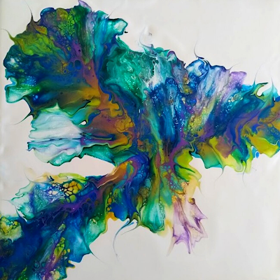
Back to doing what I love, Dutch Pours.  I really love how the colors blend and flow across the canvas. 

This one has a lot of really lovely colors.  I also did another pour using the same colors but blowing them out all over the canvas.  Hopefully, will do a larger canvas with the colors to compliment the main one in the image above. 


Colors used -

Base - Amsterdam Titanium White Colors - Atelier - Pthalo Green Pebeo - Iridescent Blue/Green Amsterdam - Greenish Blue Pebeo - Iridescent Green/Yellow Global - Metallic Blue Global - Gold Amsterdam - Ultramarine Violet Paints mixed with Australian Floetrol. My paint recipe is based on Kanella Ciraco's Aussie paint mix. You can see her video on YouTube on how to mix. Link to her video here → Kanella Ciraco Art


Video below showing the pour -


Finished 


Looks good on a wall!


Below is the video with my demo pour using the whole canvas. I think it would have looked far better on a larger canvas, so, hopefully it will look better than this one when I get to do it.


Enhanced Image


On a wall


Embellished 


Haven't uploaded these images to my Redbubble store as yet. Might do it , or, maybe not. But, will most certainly upload some of them here if I do.  Really love how my art looks on Print on Demand products. 

Here is a link to all my socials <here>


AFFILIATE DISCLOSURE: My blog contains affiliate links, which means that if you click on one of the product links, I may receive a small commission if you decide to purchase from any of the products.  

Sunday, May 8, 2022

Ribbon Pour Technique - Sunset Landscape Design #FluidArt #AcrylicPainting #Landscape

Loving the Ribbon Pours.  This one is in warm colors depicting an African Savannah Landscape.  

I embellished this one  with some silhouette images digital art to depict the African Landscape at sunset. 

Once again I used pre-mixed Mont Marte paints. Colors below -:


I also did a YouTube creation video :-


To find out more on what a Ribbon Pour is please check out my previous post >>here<<


The original without embellishments.


Once again the finished design has been uploaded to my Redbubble Store and the design looks great on all of the products. Below are some of them....


As you can see by the above examples, the designs look great. Please check out my Redbubble Store for all my other designs. 


Check out links to my other socials here →     Linktr.ee


Final art with real embellishments this time.  Love how it looks on a wall.  This is a great art mock up site to showcase your art on a wall. Gives you a really good idea of how it will look. 


AFFILIATE DISCLOSURE: My blog contains affiliate links, which means that if you click on one of the product links, I may receive a small commission if you decide to purchase from any of the products.  


Sunday, April 17, 2022

Ribbon Pour Technique - Blue Ocean Landscape #FluidArt #AcrylicPainting #Landscape


 Following on from my previous Ribbon Pour, I have created another one with a combination of blues and a hint of green to give that ocean feel to the final design.

I embellished it with digital art for the final outcome which I am very happy with. I will at a later date stencil on some images to hopefully look very similar to the above picture.


Colors used once again were all Mont Marte pre-mixed paints. 

I did a quick creation video showing the procedure from start to finish. 


To find out more on what a Ribbon Pour is please check out my previous post >>here<<


The original without embellishments above.


Ofcourse, as usual I have uploaded the final image to my Redbubble Store and the design looks wonderful on all of the products. Some of them below.

 A_Line Dress


Tote Bag


Floor Cushion


Shower Curtain


Top


As you can see by the above examples, the designs have come out beautifully on them.  Please check out my Redbubble Store for all the other products as well. 


Check out links to my other socials here →     Linktr.ee


Updated version with painted embellishments.

AFFILIATE DISCLOSURE: My blog contains affiliate links, which means that if you click on one of the product links, I may receive a small commission if you decide to purchase from any of the products.  


Friday, April 15, 2022

Paint Consistency for Fluid Art


It's not only about picking the proper colors for your subject matter, but, when it comes to selecting paints; viscosity, shine, and opacity are also important factors to consider. Acrylics come in a variety of viscosities to suit a wide range of purposes, from bottles of flowing acrylic ink to tubes of buttery thick full bodied paint. 

But, when doing a fluid art composition, it is very important to have all your paints the same consistency. Otherwise, the end product will be far from perfect. Different consistencies will have affects on your outcome. Usually, not what you want.  

So, to it is very important to make sure they are pretty close to the same consistency.

What is Consistency?

We're talking about the flow and texture of your paint, medium, and additive mixture when we say consistency.

When it comes to acrylic pouring, which is fluid art, obviously the mixture has to be easy to pour! You can compare your consistency to a few common household things, which will help you understand what your paint should look like.

Here are a couple items that you can use as a reference for a pouring consistency:

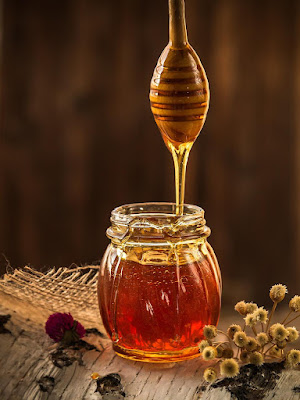
Honey that has been warmed up or chocolate syrup.


In general, your mixture should be free-flowing but not runny. It shouldn't stick to your stirring utensil in clumps or run off as soon as if you'd dipped your utensil in water. The paint should simply and evenly flow off your stirring tool when you remove it from the paint mixture.

You'll need to add a little additional paint if your paint is too thin and runny. Add a bit at a time, stirring constantly in between additions.

If the paint is too thick, you'll need to add extra medium. Add a little more at a time until the desired consistency is reached.  You can also use a small amount of water to thin your paints.


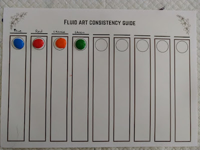
To make it easier to see if your paints are the right consistency, I created a template to check your paints before pouring. 

All you do is put a drop of paint in each circle and then tilt the paper to see the consistency. Then, it is easy to adjust the paints that are heavier or too thin. 


As you can see in the above image, the blue and green are very similar in consistency. The red is thicker and the orange too thin. 

What I would do in this situation, is add a bit more medium or water to the red until it is similar to the blue and green. The orange, I would add a bit more paint to thicken it up a bit.

If you want a copy of my template just click on the image below and save it to your computer and print as needed.  Make sure you use the landscape option before you print.  


Fluid Art - My Journey