Above is a finished digitally enhanced version of my most recent pour, a Ribbon Pour.
What is a Ribbon Pour?
A ribbon pour is where you lay the paint down in ribbons across the canvas. You can pour the paint in layers in a cup first then layer them onto the canvas , or, pour directly with each color separately onto the canvas in ribbons.
With this version, I first layered the colors into a cup then laid them down on the canvas in stripes across the canvas.
The colors I used for this pour are in the image above. All Mont Marte pre-mixed paints. Layered into three cups.
Starting with the reds and yellows, then the greens, followed by the blues and purples.
After the cups of paint are ready, I then pour the paint in ribbons across the canvas, starting with the yellow cup first, followed by the greens, then the blues and purples.
Once the paint is layered, torch any bubbles, then slowly tilt from side to side ensuring to try and keep the ribbons as straight as you can until enough paint is tipped off.
The finished product above is what I was aiming for.
The yellow section reminds me of the desert or sand, followed with the ocean in greens and blue with a purple pink and blue sky.
The finished design above.
I uploaded the image to an app where you can enhance the images. I added images to give it that landscape feel. Mainly to see how it would look. I am going to use some stencils to paint images on soon and will upload them here when I have finished.
Now, she looks like a landscape above. How cool is this??
Below is a quick YouTube video I did showing the pour.
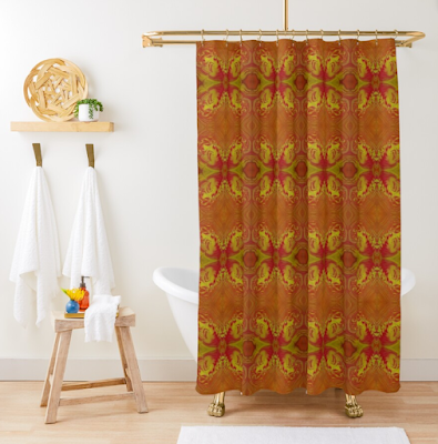
And, as usual I uploaded images of this pour digitally enhanced to my Redbubble Store. They look really good on some of their products..
As you can see by the above examples, the designs have come out beautifully on them. Please check out my Redbubble Storefor all the other products as well.
Check out links to my other socials here → Linktr.ee
AFFILIATE DISCLOSURE: My blog contains affiliate links, which means that if you click on one of the product links, I may receive a small commission if you decide to purchase from any of the products.
I feel that I have mastered how to do Dutch Pours, so, I thought I would try my hand at Starburst Dutch Pours. The above photo is one of the ones I did.
What is a Starburst Dutch Pour?
A starburst dutch pour looks like a burst star when you have finished blowing out the design. There are a few different techniques to get the end product, a starburst. But, the technique I used was laying down the paints from the centre and moving out towards the edge with rings of colored paint.
You usually have a bright color in the middle , white , yellow or even black.
Colors laid down ready to blow out.
Once the colors are set down, torch the air bubbles and blow out from the centre towards the edge until you get that starburst design.
Well, I tried 5 times to get that magical starburst. I failed mostly. Simply, I think because, my canvas was too small. I should have used a much larger canvas to give the paints more room to move.
Attempt number one above. Looks nothing like a Starburst. But, I do like the finished design. Just not what I was aiming for though.
Attempt number two above. Don't know what went wrong with this one, but, it is just one big messy chaotic mish mash of colors. But, I do like it too. But, it just is not a Starburst.
Attempt number three above. Now, this one was starting to have that starburst look. But, as you can see on the right hand side, I had the hairdryer too close to the canvas and scraped it 😁
Attempt number four. Nailed it. Well, probably not the best Starburst that I have seen, but, yes, it looks like how one should be. Problem is the centre was too big. And, ofcourse, the canvas too small. A bigger canvas would have looked far better. The centre would have looked ok being that big.
Attempt number five. Back to the drawing board.... 😆 Don't know what happened with this one. I tried to save it by putting some yellow down in the centre. Not really a traditional Starburst, but, I do like the finished product.
Will I try to do more Starbursts?? Not sure as yet. I know one thing though, I will use a bigger canvas next time, because, I do think the colors will have more room to blow out to give that Starburst look and the centre won't look so big.
If you want to see a really beautiful Starburst, and what I was trying to achieve, check out the video below by Molly from Molly's Artistry. Notice how her canvas is quite big. I think that is the trick to getting that starburst look.
Will I try this technique again?? Perhaps!! This truly is a journey. But, one that I am enjoying greatly.
I also uploaded images of some these pours digitally enhanced to my Redbubble Store. They look really good on some of their products..
And, the only one that truly looked like a Starburst in a clock design.
Please check out my Redbubble Storefor all the other products as well.
Check out links to my other socials here → Linktr.ee
AFFILIATE DISCLOSURE: My blog contains affiliate links, which means that if you click on one of the product links, I may receive a small commission if you decide to purchase from any of the products.
I recently did a series of Ring Pours in Rainbow Colors.
What is a Ring Pour?
There are a few different techniques for a Ring Pour. This one that I did was what they call a Tree Ring Pour, as the rings look like tree rings from when you cut a tree down and see their growth rings.
The unique bands of color that circle each other without blending are the beauty of a tree ring pour. It takes more than mastering the physical technique of twisting your hand as you pour to keep this form of painting from becoming an undefined, muddy mess.
While transparent colors create soft blending affects in fluid art, opaque colors are the best if you want prominent tree ring contrast. Opaque colors are less likely to dominate or cover up one another so much.
How do You Do a Ring Pour?
The secret to making tree rings is to stack each paint color in your cup as much as possible to avoid them mingling. From the side, a perfect tree ring cup will resemble layers of cake.
Thicker paint makes this task easier in this situation since the colors are less likely to mix as you pour them into your cup.
You should avoid using water to thin your paint in this method, if you regularly do so. You might also make your paint mixes thicker by utilising just heavy body acrylics (no fluid acrylics). But, in these ring pours I did actually use pre-mixed paints.
To avoid overmixing, carefully pour each color into your cup. Keep in mind that the first color you put in your cup will be the last color to come out, and hence the most dominate. So, layer accordingly to how you want your finished pour to look.
Once you have layered the colors in the cup, the next step is to carefully pour the paint onto your painting surface of choice, canvas, board or whatever you choose.
I usually start from the center and slowly let the paint flow while making a circular movement to create the rings.
Once the paint is down on your surface, you may want to check for air bubbles, and, then we do the tilt.
Slowly tilting the canvas to each corner to let the paint flow, while trying to keep the circular shape as much as possible. Which is not always easy, and, quite often the end result is not circular at all. But, still quite stunning no matter how they turn out.
It's never a good idea to overstretch when you tilt, but it's especially bad for a tree ring pour. The more you tilt, the more the colors mix and become a muddy jumble. Use additional paint in your cup to keep your lines crisp so you only have to tilt your cup a bit to cover your canvas.
You can also add extra paint around the edges to help with tilting so that your ring will move more easily as you tilt.
My five ring pours all together in the picture above. Below are some more images from my pour.
Below is a quick YouTube Video showing my Blue Ring Pour from above from start to finish.
The paints I used for the Rainbow Ring Pour Collection were all Mont Marte in a variety of rainbow colors.
I also uploaded images of these pours digitally enhanced to my Redbubble Store. They look really good on some of their products..
As you can see by the above examples, the designs have come out beautifully on them. Please check out my Redbubble Storefor all the other products as well.
Check out links to my other socials here → Linktr.ee
AFFILIATE DISCLOSURE: My blog contains affiliate links, which means that if you click on one of the product links, I may receive a small commission if you decide to purchase from any of the products.


.jpg)


.jpg)